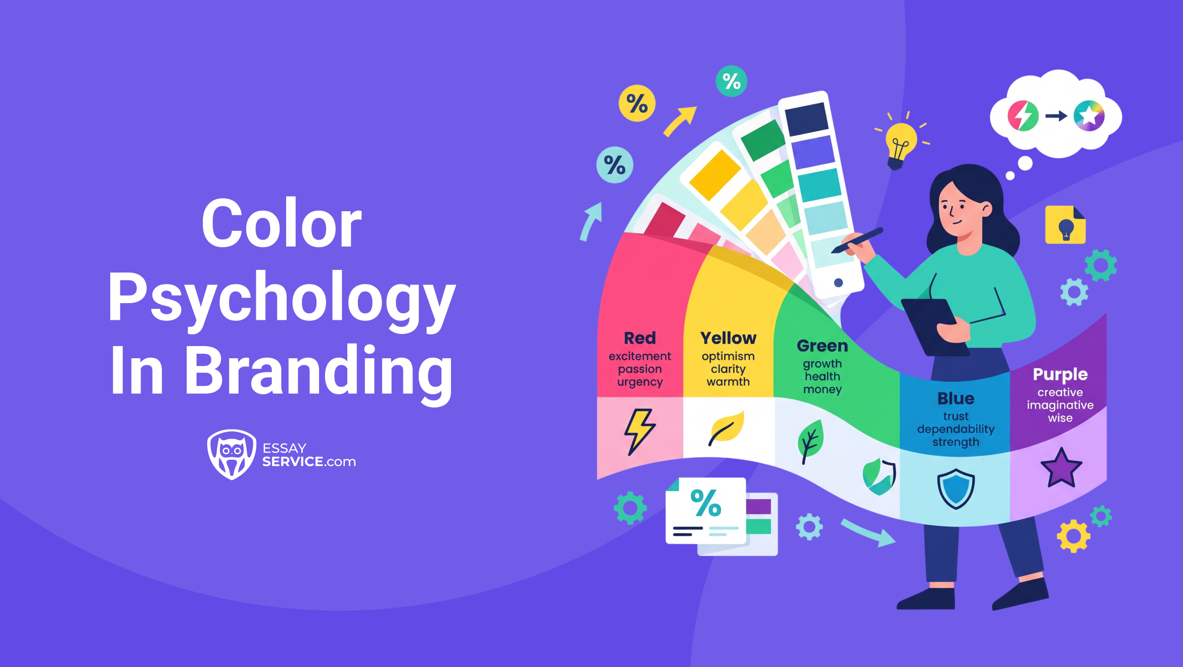
Up to 90% of a shopper's initial judgment about a product is based on color alone, and that assessment forms within roughly 90 seconds of first contact. Color psychology in branding is an important field of study now, and those high numbers are the very reason why. Anyone who wants their brand to become well-known and successful should know every nook and cranny of brand positioning, where color psychology in branding is no exception.
In this article, we’ll take a close look at how specific hues influence the way people act toward a brand/product, even without reading a word of copy. So, you can imagine how much of a core knowledge this is for a marketing student. The power of color psychology gives you a core advantage, so read closely.
What Is Color Psychology in Marketing and Branding?
Color psychology in marketing studies the relationship between specific colors and the emotional, cognitive, and behavioral responses they trigger in people. Within branding, color psychology in branding focuses on three practical areas:
Color, scientifically, is among the first visual elements the brain processes. So the emotional read usually registers way before the conscious evaluation of the content. For marketing students, this speed is what makes color such a strong signal.
If you use the same colors consistently, current and potential customers will recognize the brand 80% more, and the identity of your brand, and, consequently, awareness, will be sharpened as well. Without a solid grasp on how the colors impact the consumer’s psychology, you won’t be able to connect with the main target audience.
The Science Behind Color and Consumer Behavior
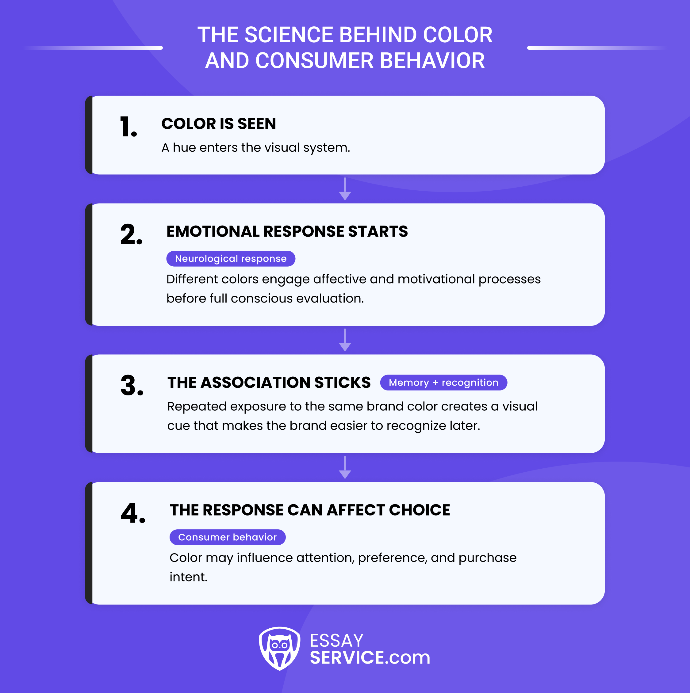
Color influences behavior because it engages the brain's affective and motivational systems before conscious reasoning takes over. The strongest recent evidence comes from a 2025 systematic review in Psychonomic Bulletin & Review, which analyzed 128 years of research across 42,266 participants in 64 countries. It found that people link specific colors to specific emotions in systematic, reliable patterns that hold across cultures. A few mechanisms explain how this reaches consumers:
- Neurological response: Different hues recruit different affective and motivational circuits, so color acts on emotion before rational evaluation.
- Nonconscious processing: Much of that response never reaches awareness, which is a large part of the psychological impact of colors on buyers.
- Memory and recognition: A consistent brand color gives consumers a reliable visual cue that speeds recall on the next encounter.
- Purchase intent: Color moves buying decisions. The size of that effect depends on product category, brand positioning, and cultural context, per recent peer-reviewed marketing research.
Roughly 85% of shoppers name color as a primary reason they pick one product over another, and color can improve readership by up to 40%. For anyone studying how colors affect consumer behavior, these findings form a reliable foundation that modern color psychology in marketing depends on.
Need all this data for a school paper in marketing? Reach out to a writer from our essay writing service and get your content and citations just right.


The Psychology of Popular Colors
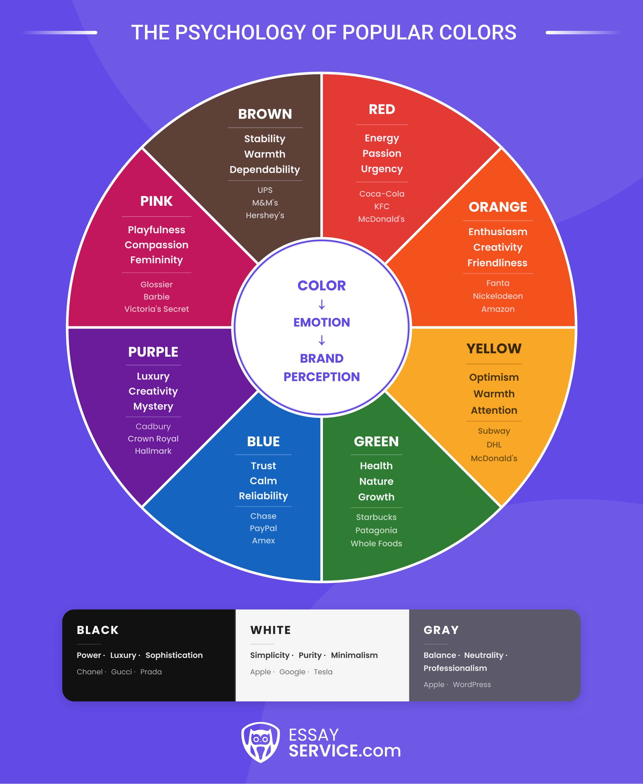
So what does color meaning in branding actually look like, one hue at a time? According to the 2025 review, the emotional response to colors holds steady enough across cultures to plan around. Take a look at a quick comparison table detailing what color triggers what response, and how brands use those triggers:
Red: Passion, Energy, and Urgency
Red gets a physical reaction out of people. Their pulse ticks up, attention narrows, appetite switches on. That very chain of effects is the whole reason Coca-Cola, McDonald's, and KFC built their identities on it. The same urgency explains the sea of red on clearance tags, since the color nudges a fast yes at the point of sale. Netflix and ESPN borrow the intensity to signal drama. Red pays off in a few specific situations:
- Launches or promotions that need immediate action
- Food and dining, where appetite does real work
- Entertainment or sport, where excitement is the product
One warning worth heeding: push red too far, and it tips into danger or anger, so most brands use it in short bursts and let calmer colors handle the everyday work.
Blue: Trust, Reliability, and Calmness
Line up the logos of the world's biggest banks. Blue, blue, and more blue. Why do Chase, PayPal, and American Express all use it? They do so to say your money is safe with them.
But it’s not only the banks that use blue. Facebook, IBM, Intel, Dell - all of these have the same color as well. And so do most hospitals and corporate firms. In all different industries, the shared choice of the color blue is made to make otherwise stressful interactions steady, and to signal the brands’ competence when it comes to the most important aspects of the customers’ lives. A 10-country YouGov survey found blue the favorite in every market it tested, across age and gender.
Green: Nature, Health, and Growth
Green has two sides. Leaves, health, freshness… that’s one half. But what color do people associate most with money (e.g., dollar bills)? Also green, which is linked to growth and prosperity. Let’s look at who uses it, and it all becomes a lot clearer:
- Whole Foods and Starbucks use it to promise something wholesome and close to the earth
- Mint and Fidelity lean on green's link to currency and financial gain
- Patagonia and The Body Shop use it to signal real environmental commitment
But now that we see virtue signaling everywhere, shoppers have gotten cynical about greenwashing, because not every brand that claims the standard maintains it. So you should be very careful about the green label, unless you can back up the eco-credentials of your product.
Yellow: Optimism, Warmth, and Attention
Yellow is impossible to ignore. Both an advantage and a risk. Raw visibility is why McDonald's pairs it with red to feel cheerful and appetizing, why Subway puts it near green (freshness), and why DHL and Hertz splash it across trucks and counters so they pop out of a busy street. LEGO and Toys "R" Us take the playful, childlike route. The middle ground is necessary, though, because a storefront drenched in yellow tires tires the eyes fast, and past a certain point, it reads as cheap.
Orange: Enthusiasm, Creativity, and Friendliness
There's a reason so many "Buy Now" buttons are orange: it draws the eye while still reading as warm and approachable, so it prompts action without feeling like a hard sell. Nickelodeon, Fanta, and Amazon use it to feel fun and current. Home Depot and Harley-Davidson use it for a jolt of adventure and grit. The color suits youthful, energetic audiences and creative businesses that want confidence without severity. And it earns its keep on calls-to-action, where visibility and approachability both matter. Overdo it, and orange starts to look loud or low-budget, so most brands treat it as a bright accent on a calmer base.
Purple: Luxury, Creativity, and Mystery
Purple spent most of history as the color of kings, for the simple reason that the dye was brutally expensive to produce. That heritage still clings to it, which is why premium and creative brands love it. Cadbury, Hallmark, and Crown Royal use purple to feel special and a little indulgent. Skincare, and anti-aging lines in particular, reach for it to suggest transformation and a premium price. Spiritual and creative brands use it for imagination and depth. Purple rewards businesses that want to feel elegant and original, though it can look misplaced on strictly practical or bargain products. Handle it with confidence, and it reads as crafted and exclusive.
Pink: Femininity, Playfulness, and Compassion
Pink has changed its job description over the years. The classic read is femininity, sweetness, romance, and play, the register Victoria's Secret, Barbie, and Glossier have worked for years. But now that brands deploy pink to push against gender assumptions, it shows up constantly in inclusive, boundary-testing campaigns. A few ways it earns a place on a modern brand:
- Beauty and cosmetics that want softness with a contemporary edge
- Products built around romance, comfort, or gentle humor
- Statements of inclusivity that reclaim pink on purpose
You will quickly earn the general public’s eye-roll if you go too hard for “pink is for girls”, because it’s an objectively outdated statement to most people. To avoid making the brand feel like it’s stuck in another era, the smart move now is to pair it with more unexpected colors.
Black: Sophistication and Power
Black is what brands use when they want to look expensive, full stop. A sense of quality and exclusivity you are meant to feel before you see the price. That’s what Chanel, Gucci, Prada, and many other luxurious brands aim for. Then there are Apple and Sony, which use black (among other colors) to read as sleek and advanced. Mercedes-Benz and BMW use this color for the same expression of sophistication and gravitas as some clothing brands.
There is a risk, though, of black coming across as cold or unapproachable when it dominates everything. The usual fix is a single accent color or plenty of open white space, which keeps the effect elegant and approachable.
White: Simplicity, Purity, and Minimalism
White is mostly about what a brand leaves out. But that can change from one brand, or even from one niche, to another.
- Apple, Google, and Tesla build so much of their identity on open space
- Hospitals and spas use white to promise cleanliness and calm
- Wedding and lifestyle brands use it for purity and the idea of a fresh start
White fits minimalist brands, health and wellness, and any tech company that treats clarity as the point. The trap is emptiness: too much white and a design can feel sterile or unfinished, so brands usually anchor it with a strong accent or confident typography to add warmth and personality.
Brown: Earthiness, Stability, and Dependability
One of the biggest missed opportunities in branding conversations is overlooking the color brown because it looks boring at first glance. All it needs to read as warm and dependable is the right handling, which Hershey’s, M&M’s, and UPS have achieved, making their products feel comforting and reliable. A few banks even choose brown for a sense of old-fashioned solidity.
Its weakness is that a careless brown palette slides into dull or dated, so contemporary brands warm it up with cream, gold, or a touch of green.
Gray: Balance, Neutrality, and Professionalism
Gray is the color of restraint, and restraint is underrated. It reads as balanced, neutral, and steadily professional, and it stays out of the way emotionally. Apple and WordPress use gray for a modern, sleek surface. B2B and corporate brands favor it precisely because it looks composed and serious. Luxury labels often set it beside black or silver for understated polish. Gray suits professional services, software, and any minimalist system that values discipline. The obvious risk is blandness: an all-gray identity can feel flat and forgettable, so gray tends to work best as the calm backdrop that lets one bright brand color do the talking.
How Color Increases Brand Recognition and Recall
Consistent use of one palette across a logo, a website, and packaging can raise brand recognition by as much as 80%, according to a University of Loyola, Maryland study. The mechanism behind that figure is that each time a person sees the same hue on the same brand, the association between the two strengthens, until eventually the color alone calls up the name. This is a very simple, almost Pavlovian reflex, and is how colors affect consumer behavior at the level of memory well before any conscious preference plays a part.
The Von Restorff effect, also known as the isolation effect, says that when a group of similar items appears together, the odd one out is the one people recall. Now let’s translate that into a supermarket aisle. A crowded app store, even. The result (and the lesson) remains the same. A color that goes outside of the category norm earns the potential customer’s attention, which is the entire logic behind choosing an unconventional hue. T-Mobile grasped this when it committed to magenta while its rivals clustered around blue.
A handful of brands have pushed the idea far enough that the color now stands in for the name:
None of this survives an inconsistent palette. A brand that changes its colors between its website, its packaging, and its ads never lets the association set, and recognition erodes along with the trust that consistency tends to build. The color branding strategies that actually work are unglamorous, and most of them come down to discipline. For a student building a brand, the sequence is worth following in order:
- Settle on one to three primary colors and refuse to deviate from them.
- Write the exact values into a brand guide (HEX, RGB, and CMYK) so the shade holds steady across screen and print.
- Put the palette in front of your target audience and confirm that people recognize and remember it before anything gets locked.
Cultural and Contextual Factors in Color Psychology
Color meaning in branding is not fixed, obviously, because the same hue can be read as positive for one audience and negative for another, and the difference is usually cultural. The psychological impact of colors is genuine, and it always passes through filters that peer-reviewed work has mapped: product category, brand positioning, and consumer demographics each moderate the effect (JMSR, 2025). This is the layer of color psychology in marketing that a careful strategist learns to respect.
Culture is the first filter, and a few examples are stark enough to be worth memorizing:
Gender is the second filter. A Current Biology study by Hurlbert and Ling found that both sexes gravitate toward blue, and that women layer an added preference for pink and purple on top of that. Purchase intent shifts along gender lines, too. Those findings work as a gentle steer for a palette, and they fall apart the moment someone treats them as a rule.
Category is the third filter. Every product category trains its customers to expect certain colors, and a brand should know those defaults before it chooses to meet or challenge them:
For your own projects, three checks matter before you commit:
- Learn the cultural background of your target audience, especially if the brand will cross borders.
- Map the color conventions of your product category, then decide where to conform and where to stand apart.
- Show the palette to diverse focus groups, because the association you intend is not always the one people receive.
How to Apply Color Psychology in Your Branding Strategy (Step-by-Step)
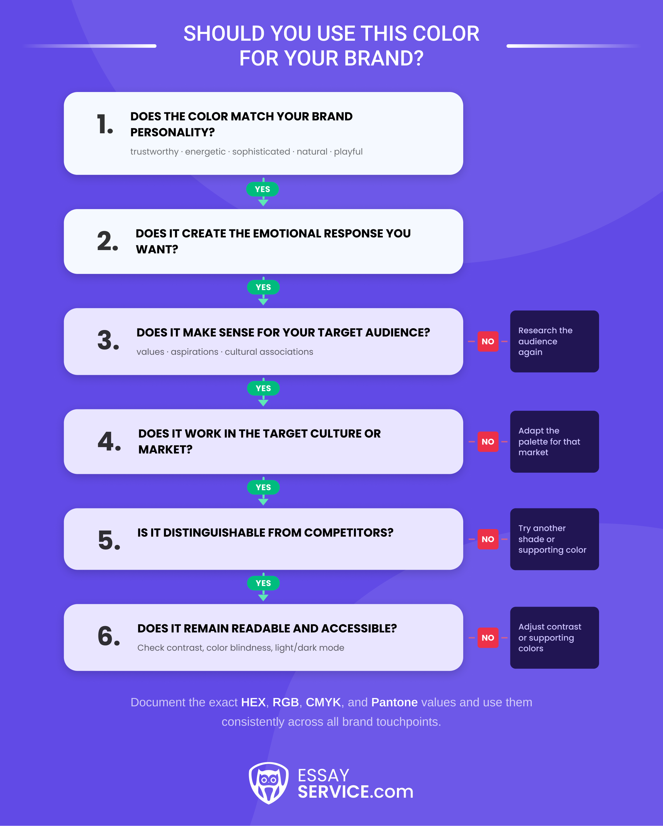
What is the brand trying to signal? Who is supposed to notice? What already dominates the category? Color psychology in marketing becomes useful once those answers exist, otherwise, it’s just a matter of taste. The steps below keep the process practical, with enough room for judgment because branding is never as neat as a color wheel suggests.
Step 1: Define the Brand
Write down three or four traits most necessary for your brand to convey before touching the palette. Competent? Rugged? Polished? Energetic? Whatever actually fits. Then see which colors make sense beside those words.
A bank that wants to feel dependable has an obvious case for blue. A sports brand pushing speed and intensity may land closer to red or orange. A quick way to narrow things down is to:
- List the core traits.
- Cross out colors that clash with them.
- Compare what remains against the category.
Step 2: Look Past Age, Gender, and Income
Demographics are useful, but not universal. Two female 25-year-olds with the same income can want completely different things from the same product. Look at:
- Values
- Aspirations
- Emotional priorities
- Cultural background
- Relevant gender preferences
- Existing expectations around the category
Then look sideways at competitors.
Say nearly every fintech app in the market uses blue. That tells you that blue already carries the right associations there. It also tells you that another nearly identical navy may disappear immediately.
The better question is not “What color does this audience like?” It is “What will this color mean here, beside everything else they already see?”
Step 3: Decide Which Color Gets to Be the Main One
A brand usually benefits from having one color people can identify quickly, rather than several hues competing for equal attention.
Before locking it in, check three things:
- Does it fit the brand?
- Does it make sense in the category?
- Is it distinguishable from competitors?
Put the proposed color beside five or six competing brands. Remove the logos. If your choice suddenly looks anonymous, the problem is obvious.
You may not need a completely different hue, either. Sometimes a less expected shade, paired with a sharper supporting color, gives enough distance without making the brand feel out of place.
Step 4: Add Supporting Colors Without Turning It Into a Rainbow
Once the main color is settled, build around it. Two or three supporting colors are usually enough.
You can use familiar color relationships:
- Complementary: Opposite hues with strong contrast
- Analogous: Colors sitting close together
- Triadic: Three spaced hues with more variation
Then add neutrals. Black, white, and gray tend to end up doing far more work than people expect, especially once typography, buttons, forms, backgrounds, and packaging enter the picture.
Put actual text on the colors before approving anything. Palettes often look fine as little swatches and become a problem as soon as somebody has to read eight-point copy on them.
Step 5: Identify the Exact Colors
Once everyone approves the palette, stop relying on eyesight. “Use the dark green” is not useful guidance for a designer, printer, or freelancer. Give them exact values.
If the brand uses lighter tints, darker versions, gradients, or special background combinations, document those too.
This is the unglamorous part, but it saves a lot of cleanup later. Otherwise, one “close enough” blue turns into four slightly different blues across packaging, Instagram, presentations, and the website.
Step 6: Make Sure the Brand Still Looks Like Itself Everywhere
The palette should survive outside the logo. Check it across:
- Website and mobile app
- Packaging
- Ads
- Social media
- Product design
- Stores or offices
- Signs and printed material
Do not force every surface to use the colors in exactly the same proportions. That usually looks rigid. The system just needs to remain recognizably the same.
A useful test is to cover the logo on several pieces of branded material. If they still feel connected, the color system is doing its job.
If Instagram looks like one company and the website like another, adding more rules is probably more useful than adding more colors.
Step 7: Test What People Actually Do With It
At some point, opinions have to give way to evidence.
Try different color versions on buttons, ads, or landing pages and compare what happens. Surveys are useful when you want to know how people describe the brand. Focus groups can help when reactions are harder to reduce to one metric.
Keep an eye on:
- Click-through rate
- Conversion rate
- Brand recall
- Recognition
- Change one thing at a time when possible
- Do not overreact to one odd result
- Check whether the issue is color, layout, or copy
- Keep what works, even if someone on the team is bored with it
Real-World Example: Why Spotify's Palette Works
Spotify is a useful brand to pull apart because the system is easy to see.
Color
What it contributes
Green
Energy and freshness
Black
Weight and strong contrast
White
Clarity and breathing room
The important part is not “green means energy, therefore Spotify works.” That is too simple.
The green is repeated constantly. Black gives it a stronger base. White keeps the interface readable. Typography, layout, product design, and years of repetition do the rest.
For a student project, take three competing brands from the same category and compare them side by side. You will learn more from spotting their differences than from memorizing another chart of color meanings. And if you need to bring all of this together, our PowerPoint presentation writing service can help you create engaging slideshows.
Common Color Psychology Mistakes Marketing Students Make
Problems with color psychology in branding usually appear before the palette is even finished. Someone picks a favorite color, copies a competitor, follows a trend, or forgets that people still need to read the text. The result may look polished in a presentation and fall apart once it reaches a real audience. These are the mistakes worth catching early.
Mistake #1: Relying on Personal Taste
This happens constantly. Someone likes purple, so the brand suddenly becomes “creative” and the reasoning gets built afterward. Take advantage by doing it the other way around.
Look at the audience, product, personality, and category first. Then choose from the colors that actually fit. Personal taste can break a tie, maybe. It should not be running the whole decision.
Mistake #2: Assuming a Color Means the Same Thing Everywhere
Color associations are not universal rules. A shade that feels positive in one market can carry a completely different meaning somewhere else. If the brand will reach international or culturally mixed audiences, check those associations before committing.
That small piece of research can save an otherwise solid color psychology in marketing decision from becoming awkward in a new market.
Mistake #3: Adding Another Color Every Time Something Feels Missing
This is how palettes get bloated. One color is added for energy, another for trust, another for warmth, then a fourth because the presentation still feels “flat.” Soon, nothing has priority.
Keep the system tighter: one dominant color, a few supporting hues, neutrals where needed. Recognition becomes much easier when people are not being asked to remember six equally important colors.
Mistake #4: Using Three Different Versions of the Same Blue
Tiny shade changes seem harmless until they appear everywhere. The website has one blue. Social media uses a slightly brighter one. Print comes back darker again. That weakens consistency fast. Record the exact HEX, RGB, CMYK, and Pantone values and make people use them.
Mistake #5: Choosing a Trend Because Everyone Else Did
Millennial pink had its moment. So did Gen Z green. More will follow.
A trend can tell you what currently feels familiar or current, but that does not make it right for the brand.
Use trend information as context. Then ask the harder question: does the color still fit the product, audience, and personality without the trend attached? If not, leave it alone.
Mistake #6: Approving a Palette Nobody Can Read
A nice-looking combination can still be unusable.
Low contrast makes text difficult to read, especially for people with visual impairments. Test actual text-and-background pairs, not just swatches sitting next to each other.
WCAG requires at least a 4.5:1 contrast ratio for normal text. Check that while the palette is still flexible, not after the site has already been designed.
Mistake #7: Researching Competitors and Then Copying Them
Competitor research is supposed to show you the category, not hand you a palette.
If every rival uses blue, blue may still make sense. But copying the same tone, same supporting colors, and same visual treatment gives people very little reason to remember you.
The Von Restorff effect helps explain why some degree of difference matters: the odd item in a similar group is easier to notice and recall.
Quick Color Strategy Check
Before submitting the project, check the logic behind the palette:
- Do the colors fit the brand personality?
- Have cultural associations been checked?
- Does the main color stand apart enough from competitors?
- Are exact color values documented?
- Does the palette stay consistent across formats?
- Is the text readable on every important color combination?
Future Trends in Color Psychology for Branding (2026+)
The next shift in color psychology in marketing will probably not come from a new list of meanings attached to red, blue, or green. The more interesting change is practical: brands are getting better at adjusting color to the person, the screen, and the context in which it appears. Some of that is already happening. The parts worth watching are the ones that change how palettes are built in the first place.
AI Could Make Some Brand Colors Flexible
A brand may still have one recognizable core palette while certain colors around it change according to the user.
That is where AI becomes useful. An e-commerce site could learn that one customer segment responds better to a darker CTA, while another clicks more often on a brighter version. The logo does not need to change. Neither does the whole website. Small pieces can.
I would expect this to show up first in:
- CTA buttons
- Promotional banners
- Product recommendations
- Landing pages
The important limit is recognition. Personalization stops helping once the brand starts looking different every time someone visits.
Accessibility Will Affect the Palette Before Design Starts
Accessibility used to be something teams checked near the end: does the text pass contrast requirements, yes or no? That order is changing.
A stronger approach is to eliminate weak combinations before they become part of the identity. Color-blind users, people with reduced vision, and anyone viewing a screen in poor conditions should not have to depend on tiny differences between two similar shades.
Color also should not carry every distinction by itself. In practical interfaces, I would rather see:
- Color plus an icon
- Color plus a text label
- Different patterns in charts
- Clear borders between states
That gives the design another way to communicate when color fails.
Light and Dark Mode Will Need Their Own Color Decisions
The exact green, blue, or orange that looks right on white may become too bright, muddy, or difficult to read against black. Simply flipping the background is rarely enough. Brands increasingly need approved light-mode and dark-mode versions that still feel related.
That may mean changing:
- Brightness
- Saturation
- Neutral tones
- Contrast between secondary colors
For color branding strategies, I think this becomes a standard brand-guideline issue rather than something left entirely to product designers. If both versions appear regularly, both belong to the identity.
Biometric Testing May Add Another Layer to Color Research
Surveys have an obvious limitation: people explain their reaction after it has already happened.
Eye-tracking, EEG, and other biometric methods can give researchers another view. Instead of asking only which package someone preferred, a team could compare where attention went first, how long someone looked at an element, or whether different color versions produced noticeably different responses.
That is useful, but it is easy to oversell.
A biometric test cannot tell a company that “red works best” in general. It can tell them that, for this audience, in this design, under these conditions, one version produced a different response. That narrower conclusion is much more useful anyway.
Frequently Asked Questions
What Is Color Psychology in Branding?
How Does Color Affect Consumer Behavior?
What Color Increases Brand Recognition?
Do Color Meanings Vary Across Cultures?

Jennifer is a student currently pursuing a Journalism major. She oversees the EssayService blog team and uses her journalism skills to ensure all blog posts are accurate, trustworthy, and engaging.



New posts to your inbox
Your submission has been received!